Page 2 of 2

Re: TKG's Art

PostPosted: Sun Oct 13, 2013 1:00 am
by time-killer-games
Thanks for the wonderful help! I'll check these out and post my results here when I'm done. Thanks for everything! :D

Re: TKG's Art

PostPosted: Mon Oct 14, 2013 3:44 am
by time-killer-games
Wonderful news! Sweet home 3d is working again for me.
Image

Re: TKG's Art

PostPosted: Mon Oct 14, 2013 10:52 am
by Simon
Yeah ! Much better ! Use the same work on textures in your next projects !

Now I (personally) think it' even better like this :

Image

I worked on 2 things :

1 - Color balance
In your picture, everything is saturated everywhere.
--> I prefer to saturate only on certain parts of the picture. I choose which objects are interesting to saturate, and which ones are not.
Doing this, the eye is attracted on some details, and not on others, which is a way to catch the attention of the spectator.

2 - Lighting
In your picture, despite dark shadows and overburned areas, the main ambiance is flat.
--> I darkened the foreground a little, and added more brightness near the lamp. Thanks to that, we have the sensation that the lights are travelling in your scene, and they get less efficient when we're far from the light source. Like in reality, a bulb will emit a lot of light, and the more far you are from it, the less light you receive.

What do you think of these techniques ?

Of course I did it quick, and it would require more attention to be retouched correctly. And it's also up to your personal tastes !!

Re: TKG's Art

PostPosted: Wed Oct 16, 2013 6:01 pm
by Simon
I hope I didn't discourage you with my previous answer ! :shock:

Re: TKG's Art

PostPosted: Fri Oct 18, 2013 12:39 am
by time-killer-games
You didn't, I'm in the process of finalizing the new render as we speak.

Re: TKG's Art

PostPosted: Fri Oct 18, 2013 1:06 am
by time-killer-games
Image

Re: TKG's Art

PostPosted: Fri Oct 18, 2013 10:10 am
by Simon
OK, you really like when it's very colorful :mrgreen: I prefer it more discreet, but it's up to you.
The picture seems good though.

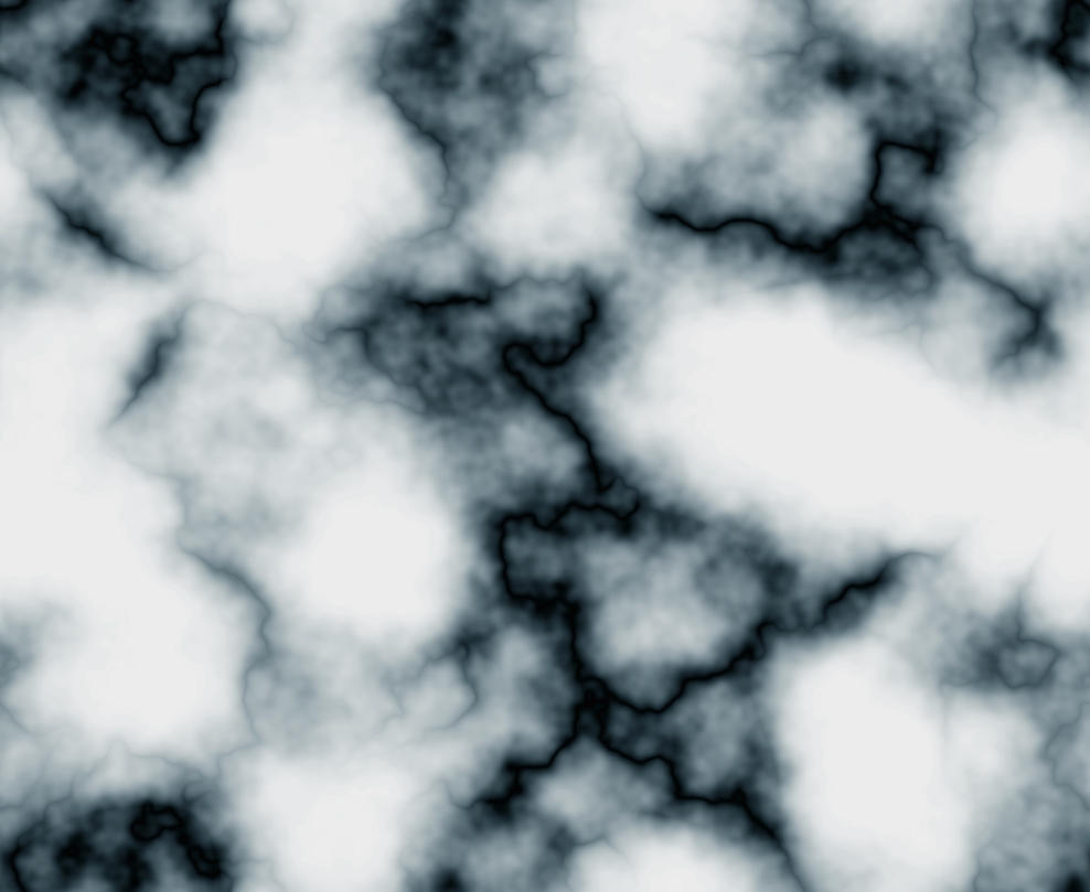
The last thing I would change is the texture of cracks. Once again it's a matter of scale and being subtle. These cracks don't seem realistic, and I think they need to be smaller, fewer and maybe less dark.

Image

You know, there's one single question that you should ask yourself :
Are you happy with the result of your work ?

If the answer is yes, and if you think you have improved your picture, then don't worry what the others can say (including me) !

Re: TKG's Art

PostPosted: Sat Oct 19, 2013 6:33 pm
by time-killer-games
It's actually not meant to be cracks, it's marble.
This isn't the texture I used but unlike the one I used it's an actual photograph and not made from scratch:
Image
I've also seen marble walls over at a museum at norfolk a few minutes away from where I live, and the dark "cracks" are actually that big though if it were really cracks, you're right that would be out of proportion. Also I scrapped the idea of using so much contrast and bright colors, you're right it's very unrealistic. I'll share the update in a few.thanks simon. :-)

Re: TKG's Art

PostPosted: Mon Oct 21, 2013 3:48 pm
by Simon
I see. Why don't you use a photo, then ? That's what I've been talking about in the previous posts.
One of these, maybe ?
http://www.cgtextures.com/texview.php?i ... u7466feej3

Re: TKG's Art

PostPosted: Sun Nov 24, 2013 4:49 am
by time-killer-games
Image

Image

Re: TKG's Art

PostPosted: Fri Jan 24, 2014 8:26 pm
by time-killer-games
Ye finds yeself in yon closing in spiked wall dungeon.
Only but ogre skull filled coffins to keep thy comfy.
Door be bolted shut. How wouldst thou surviveth?

Regular Bryce 7.0 Render of my 3D scene This
one I think looks good but still kinda bland without
at least a little more contrast? At least IMHO.
Image

Bryce Render + pixlr.com high contrast effect
This one to me looks better but it's hard for me to
decide if it's too much contrast, where as too much
is unrealistic and too dramatic. So which one
should I go with guys? Or something in between?
Image

Re: TKG's Art

PostPosted: Fri Jan 24, 2014 10:17 pm
by reneuend
I prefer the 1st one. It's softer and more realistic, IMO. You don't normally see things in high contrast unless you are using a very strong flashlight in a dark room.

Re: TKG's Art

PostPosted: Sat Aug 23, 2014 9:33 pm
by time-killer-games
Thumbnail spoiler.
Image
The screenshots I have to preview ATM are way too huge to embed so here's the links.
https://db.tt/akeZ4iIp
https://db.tt/ZgaRz2yA
https://db.tt/BIPGL62v
https://db.tt/nZwIc9aQ
https://db.tt/y73b0hMr

Re: TKG's Art

PostPosted: Sat Aug 23, 2014 10:37 pm
by reneuend
Nice work, TKG. Are you just drawing or is this images in an upcoming game?
What did you use to draw these?
Thanks for sharing.

Re: TKG's Art

PostPosted: Sun Aug 24, 2014 2:42 am
by time-killer-games
They are for "Dungeon Blabber" but the official name for the game I still haven't decided yet. The current is a placeholder.