Here's all I have so far..
Download small:
http://members.cox.net/time-killer-games/small.gif
Download large:
http://members.cox.net/time-killer-games/large.gif
Preview:
TKG's Art
Moderators: time-killer-games, Vengeance66, Candle, reneuend, GM-Support
45 posts
• Page 1 of 2 • 1, 2
TKG's Art
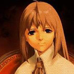
![]() by time-killer-games » Sat Feb 05, 2011 5:53 pm
by time-killer-games » Sat Feb 05, 2011 5:53 pm
- Attachments
-
- small.gif (648.31 KiB) Viewed 24102 times
Last edited by time-killer-games on Sat Feb 19, 2011 3:40 pm, edited 3 times in total.
-

time-killer-games - Expert Member
- Posts: 400
- Joined: Fri Dec 24, 2010 6:10 pm
- Location: Virginia Beach, VA

Fine
![]() by Harvester » Sun Feb 06, 2011 10:48 am
by Harvester » Sun Feb 06, 2011 10:48 am
If it would disturb anyone they could tell and it would be removed. But why would I be a moderator on a site where this should be banned?  It looks cool. Maybe it's someone getting out from a womb/stomach/'meatpod' (from Oblivion)/etc?
Harvester
Harvester
*** www.nikotinzenekar.hu <-2011. album titled 'Mese' free to download! (5th button). *** www.mydarkmind.atw.hu <- under construction for a while.
-

Harvester - Forum Master
- Posts: 883
- Joined: Mon Jan 10, 2005 6:28 pm
- Location: Hungary

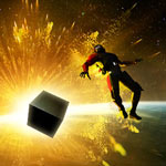
![]() by time-killer-games » Fri Nov 25, 2011 10:27 pm
by time-killer-games » Fri Nov 25, 2011 10:27 pm
Just playing around with some 3D rendering programs...
- Attachments
-
- static.png (561.34 KiB) Viewed 23236 times
-
- animated.gif (1.58 MiB) Viewed 23236 times
-
time-killer-games - Expert Member
- Posts: 400
- Joined: Fri Dec 24, 2010 6:10 pm
- Location: Virginia Beach, VA
Good
![]() by Harvester » Sat Nov 26, 2011 8:39 am
by Harvester » Sat Nov 26, 2011 8:39 am
Good work, it has a unique atmosphere! Just keep playing around with that program 
Harvester
Harvester
*** www.nikotinzenekar.hu <-2011. album titled 'Mese' free to download! (5th button). *** www.mydarkmind.atw.hu <- under construction for a while.
-
Harvester - Forum Master
- Posts: 883
- Joined: Mon Jan 10, 2005 6:28 pm
- Location: Hungary
![]() by time-killer-games » Sat May 19, 2012 2:34 am
by time-killer-games » Sat May 19, 2012 2:34 am
With very special thanks to you guys for introducing me to the free bryce limited time offer... ... before it expired! 
- Attachments
-
- down_to_hell.png (1.97 MiB) Viewed 22430 times
-
time-killer-games - Expert Member
- Posts: 400
- Joined: Fri Dec 24, 2010 6:10 pm
- Location: Virginia Beach, VA
![]() by time-killer-games » Sat May 19, 2012 5:52 pm
by time-killer-games » Sat May 19, 2012 5:52 pm
Thanks guys! You're awesome.
@reneuend,
Try out this easy to use terrain editor:
http://gmc.yoyogames.com/index.php?showtopic=526631
after downloading, its pretty straight forward. Make a terrain and export it as Lightwave Obj (note it might take a while). Then you can import your custom terrain into Bryce via File menu->import object. That's how I made this and it took me just a few minutes! I really recomend this to any owner of bryce that would like to sculpt stunning terrains such as what you can see in my above post.
@miss mira,
As for the game it will be used in, it's He||'s Candle, which isn't being developed in AM, though You can check out the demo over in the general chat. It will cost roughly $8 to buy tge full version from me when completed.
@reneuend,
Try out this easy to use terrain editor:
http://gmc.yoyogames.com/index.php?showtopic=526631
after downloading, its pretty straight forward. Make a terrain and export it as Lightwave Obj (note it might take a while). Then you can import your custom terrain into Bryce via File menu->import object. That's how I made this and it took me just a few minutes!
@miss mira,
As for the game it will be used in, it's He||'s Candle, which isn't being developed in AM, though You can check out the demo over in the general chat. It will cost roughly $8 to buy tge full version from me when completed.
-
time-killer-games - Expert Member
- Posts: 400
- Joined: Fri Dec 24, 2010 6:10 pm
- Location: Virginia Beach, VA
![]() by time-killer-games » Wed Jun 13, 2012 1:11 am
by time-killer-games » Wed Jun 13, 2012 1:11 am
I came back from vacation recently, and along the way I got some inspiration... I noticed a game on the AM games page that had the title Cabin Fever. I couldn't think of any name better than that, so until I come up with a more original name, Cabin Fever it is...
- Attachments
-
- Cabin Fever.png (97.34 KiB) Viewed 22222 times
-
- cf008.png (1.37 MiB) Viewed 22222 times
-
- cf001.png (1.48 MiB) Viewed 22222 times
-
time-killer-games - Expert Member
- Posts: 400
- Joined: Fri Dec 24, 2010 6:10 pm
- Location: Virginia Beach, VA
![]() by time-killer-games » Wed Jun 13, 2012 4:56 am
by time-killer-games » Wed Jun 13, 2012 4:56 am
I've got a lot of project being made atm, Cabin Fever will either be free or $0.50 depending on the finished duration of gameplay. This is likely to be the first project I've ever completed with AM. Right now it has roughly 100 frames.
Edit: Here's my new title screen:
https://www.dropbox.com/s/bk4wkswugucyxdi/title.gif
Edit: Here's my new title screen:
https://www.dropbox.com/s/bk4wkswugucyxdi/title.gif
-
time-killer-games - Expert Member
- Posts: 400
- Joined: Fri Dec 24, 2010 6:10 pm
- Location: Virginia Beach, VA
Re: TKG's Art
![]() by time-killer-games » Thu Apr 11, 2013 5:03 am
by time-killer-games » Thu Apr 11, 2013 5:03 am
My latest project designed in AM and Bryce, "e3D: The Laboratory"
It's specifically targeted at the HTML platform. It's not as easy to make inventories that work with that, since it takes a lot of variables and precisely placed hotspots. I won't stop working on this one until it is 100% spotless. Due to the small environment of the game, I won't post anymore screens until its released. I'm doing my best to fit in as many puzzles as possible in the frames...
It's specifically targeted at the HTML platform. It's not as easy to make inventories that work with that, since it takes a lot of variables and precisely placed hotspots. I won't stop working on this one until it is 100% spotless. Due to the small environment of the game, I won't post anymore screens until its released. I'm doing my best to fit in as many puzzles as possible in the frames...
- Attachments
-
- e3D: The Laboratory
- image.jpg (218.41 KiB) Viewed 21086 times
-
time-killer-games - Expert Member
- Posts: 400
- Joined: Fri Dec 24, 2010 6:10 pm
- Location: Virginia Beach, VA
Re: TKG's Art
![]() by reneuend » Sat May 04, 2013 1:28 am
by reneuend » Sat May 04, 2013 1:28 am
Awesome work TKG. I haven't delved into 3D modeling yet. I hope someday to try it out though.
---


-

reneuend - Administrator
- Posts: 2762
- Joined: Sat Nov 22, 2008 8:37 pm
- Location: Midwest Cornfield, USA
Re: TKG's Art
![]() by time-killer-games » Wed Sep 18, 2013 10:37 pm
by time-killer-games » Wed Sep 18, 2013 10:37 pm
Something more recent:
Mysteries of the Bible
Arts and History
MUSEUM

The game takes place in a museum which carries
many precious and sacred artifacts and artworks.
With no recollection of how you ended up there,
Can you unlock the ancient secrets behind such
a mysterious place? Coming December 2013.
Cheers!
Time Killer Games Productions
Mysteries of the Bible
Arts and History
MUSEUM
The game takes place in a museum which carries
many precious and sacred artifacts and artworks.
With no recollection of how you ended up there,
Can you unlock the ancient secrets behind such
a mysterious place? Coming December 2013.
Cheers!
Time Killer Games Productions
-
time-killer-games - Expert Member
- Posts: 400
- Joined: Fri Dec 24, 2010 6:10 pm
- Location: Virginia Beach, VA
Re: TKG's Art
![]() by Vairon » Thu Sep 19, 2013 8:07 am
by Vairon » Thu Sep 19, 2013 8:07 am
Can you tell us about plot?
-

Vairon - Forum Master
- Posts: 500
- Joined: Sat Jul 14, 2007 12:40 pm
- Location: Spain
Re: TKG's Art
![]() by time-killer-games » Thu Sep 19, 2013 6:28 pm
by time-killer-games » Thu Sep 19, 2013 6:28 pm
Thanks guys!
@Vairon: About the plot, what I've already
shared pretty much explains that.
More:

@Vairon: About the plot, what I've already
shared pretty much explains that.
More:
-
time-killer-games - Expert Member
- Posts: 400
- Joined: Fri Dec 24, 2010 6:10 pm
- Location: Virginia Beach, VA
Re: TKG's Art
![]() by time-killer-games » Wed Oct 09, 2013 4:38 am
by time-killer-games » Wed Oct 09, 2013 4:38 am
@Simon - if you're reading this, since you are the graphics expert, feel free to express your thoughts on my work. Slowly but surely I'm adding touch ups. I'm a bit of a perfectionist which makes time management rather difficult.

-
time-killer-games - Expert Member
- Posts: 400
- Joined: Fri Dec 24, 2010 6:10 pm
- Location: Virginia Beach, VA
Re: TKG's Art
![]() by Simon » Wed Oct 09, 2013 11:45 am
by Simon » Wed Oct 09, 2013 11:45 am
Hey TKG ! You're doing good and I think you're improving your work with each of your pictures. Some of them remind me the pictures I was making a few years ago, when I was trying to make fantasy worlds. All I can do is cheer you up, because working again and again on your 3D scenes is the best way to improve your skills. I've been making 3D for 15 years now, and I start to know when someone is on the good way.
I also see you're starting to use photoshop (or other) to add blur, effects, and to work on colors. It's a very good idea, so keep doing that ! Be careful not to add too much blur though, and not to saturate the colors. I know that in ASA I added quite too much effects sometimes.
Now, I'll be honest : there's still a lot of things you can improve. I believe I could give you the same advice than the ones I gave to Vengeance. I was explaining him a few tips after trying Shadows II, and I saw the same kind of issue in both of your works. There are some similitudes between your works. You're somehow doing the same "mistakes", and basically it's a matter of textures scale, and 3D objects scale.
Look, I had shared this with V66 :
1 - Texture size.
In your work, the textures need to be reworked. Most of the time, you use a repetitive pattern. It's either some wood on a table, or either some stones on a wall. Your first mistake is when your textures have a bad size. When you have a crack in a rock that is too big, it doesn't seem natural. Idem if the stones of a wall are much bigger than they should. And the same again if the joints between the stones are larger than a hero's head. I exagerate, but it's to explain the main idea. So you need to resize your texture to make it fit the view.
Then your second issue with the textures is when they repeat too much. It's not beautiful to look at, when you see the same detail of a pattern again and again and again. In the same idea, a 3D object can be duplicated in a scene, but its texture should be changed.

2 - global scale.
This rejoins the 1st part. When some elements of your scene are not correctly sized, it seems unnatural too. It can be a texture (stones too big on the wall), or a 3D object (a table with strange proportions). So, in your 3D software, take an object as reference, and rescale the others so they don't seem disproportionate when everything is in the same scene.
If you need great textures, just register (it's free) on CGtextures.com and download them as much detailed and large as you can.
If you need 3D models, register (it's free) on Turbosquid.com, make a search, then sort the result by "lower price", and download the free models you want.

3 - harmonize your style
This is a difficult part : trying to make your style unique for each 3D object you create, in order to have a global environment that seems real, and in harmony. The best example I can see to explain is the following :
In your picture, you have both realistic textures AND unrealistic textures. The ceiling, near the lamp, seems to have a nice concrete texture (probably a photo), while the shields have a schematic texture ( a drawing with flat colors). They don't fit together ! If you choose to have photos as textures somewhere, then you must have photos everywhere. So the solution for your shield is : add some details of metal in the yellow cross and the red paint, using some photos, in order to make them look realistic.

I hope I helped. Please stay motivated, and try to work on this. Show us the next pictures and I'll keep telling you what you can change. Good luck !
I also see you're starting to use photoshop (or other) to add blur, effects, and to work on colors. It's a very good idea, so keep doing that ! Be careful not to add too much blur though, and not to saturate the colors. I know that in ASA I added quite too much effects sometimes.
Now, I'll be honest : there's still a lot of things you can improve. I believe I could give you the same advice than the ones I gave to Vengeance. I was explaining him a few tips after trying Shadows II, and I saw the same kind of issue in both of your works. There are some similitudes between your works. You're somehow doing the same "mistakes", and basically it's a matter of textures scale, and 3D objects scale.
Look, I had shared this with V66 :
1 - Texture size.
In your work, the textures need to be reworked. Most of the time, you use a repetitive pattern. It's either some wood on a table, or either some stones on a wall. Your first mistake is when your textures have a bad size. When you have a crack in a rock that is too big, it doesn't seem natural. Idem if the stones of a wall are much bigger than they should. And the same again if the joints between the stones are larger than a hero's head. I exagerate, but it's to explain the main idea. So you need to resize your texture to make it fit the view.
Then your second issue with the textures is when they repeat too much. It's not beautiful to look at, when you see the same detail of a pattern again and again and again. In the same idea, a 3D object can be duplicated in a scene, but its texture should be changed.
2 - global scale.
This rejoins the 1st part. When some elements of your scene are not correctly sized, it seems unnatural too. It can be a texture (stones too big on the wall), or a 3D object (a table with strange proportions). So, in your 3D software, take an object as reference, and rescale the others so they don't seem disproportionate when everything is in the same scene.
If you need great textures, just register (it's free) on CGtextures.com and download them as much detailed and large as you can.
If you need 3D models, register (it's free) on Turbosquid.com, make a search, then sort the result by "lower price", and download the free models you want.
3 - harmonize your style
This is a difficult part : trying to make your style unique for each 3D object you create, in order to have a global environment that seems real, and in harmony. The best example I can see to explain is the following :
In your picture, you have both realistic textures AND unrealistic textures. The ceiling, near the lamp, seems to have a nice concrete texture (probably a photo), while the shields have a schematic texture ( a drawing with flat colors). They don't fit together ! If you choose to have photos as textures somewhere, then you must have photos everywhere. So the solution for your shield is : add some details of metal in the yellow cross and the red paint, using some photos, in order to make them look realistic.
I hope I helped. Please stay motivated, and try to work on this. Show us the next pictures and I'll keep telling you what you can change. Good luck !
-
Simon - Expert Member
- Posts: 418
- Joined: Sun Jun 10, 2012 1:47 pm
- Location: France
Re: TKG's Art
![]() by time-killer-games » Wed Oct 09, 2013 2:56 pm
by time-killer-games » Wed Oct 09, 2013 2:56 pm
Thank you! Excellent feedback! I've been recommended the same about textures before but I never had an example show the difference. You're right, I have a lot to improve, but it's very do-able. Just so you know, the textures I use (in the museum game renders) are all mine either made from scratch or from an edited photo I took. So yeah making the textures with some of more detail and others with less repetition shouldn't be that hard. Thanks for everything I'll be sure to add more real soon.
-
time-killer-games - Expert Member
- Posts: 400
- Joined: Fri Dec 24, 2010 6:10 pm
- Location: Virginia Beach, VA
Re: TKG's Art
![]() by Simon » Wed Oct 09, 2013 3:22 pm
by Simon » Wed Oct 09, 2013 3:22 pm
@Simon - if you're reading this, since you are the graphics expert
I had no other choice but to help, since I'm the graphics expert
the textures I use are all mine either made from scratch or from an edited photo I took.
It's good to make your textures yourself. I also take my camera with me everytime I go on a walk and try to shoot textures here and there. Continue to make your own textures ! But it's also very useful to have cgtextures.com when you're in a hurry ^^
---
Also, if you would like to have a photorealistic lighting, you can try Maxwell Studio, that you can use after you modeled your scene in Bryce. There's a "try" version here :
http://www.maxwellrender.com/index.php/try_
How it works ?
-> you model your scene with your favorite soft
-> you export your scene to one of the formats accepted by Maxwell (you'll need to check, I don't remember which they are)
-> import your 3d scene in Maxwell Studio and start working on textures and lighting.
It's quite a lot of work, because you'll need to learn the soft, but trust me the result is truely amazing. This is the perfect professional tool for people who want to make photorealistic pictures.
Just have a look at their gallery, most of the pics look like photos : http://www.maxwellrender.com/index.php/ ... es/6/1/456
-
Simon - Expert Member
- Posts: 418
- Joined: Sun Jun 10, 2012 1:47 pm
- Location: France
Re: TKG's Art
![]() by time-killer-games » Sat Oct 12, 2013 4:13 am
by time-killer-games » Sat Oct 12, 2013 4:13 am
I like what I see in the maxwell showcase but honestly I prefer what I'm already using, which is sweet home 3D. I like it mainly because the rendering is decent enough to make scenes look good and fit my standards, but most of all I use it because it's free and open source. If I get enough money to buy maxwell pro down the road, I'll probably get it. Thank you for recommending it to me! It's a very impressive software!
As for the repetitive, out of proportion, and lacking detail textures, I'm re-rendering the scene overnight I will post the result tomorrow morning. Hopefully you'll like and be satisfied with what you'll see. All of the flaws you mentioned I already fixed. Thanks for everything simon!
And honestly the blur and saturation I used in my most recent screenshot I'm going to keep because to me it makes the visuals more fun and interesting to look at. I know the blur and saturation can be overdone but I feel that isn't the case in my screenshot. In real life yeah visuals aren't crazy saturated unless your tripping on acid so I can see what you mean too much saturation is not realistic but to me whether it looks realistic or not, as long as it looks good that is what I really care about. Again, thanks for your advice I really appreciate to hear your perspective, you have a decade of more experience under your belt than me, and that shows you know what your talking about,
Cheers!
-
time-killer-games - Expert Member
- Posts: 400
- Joined: Fri Dec 24, 2010 6:10 pm
- Location: Virginia Beach, VA
Re: TKG's Art
![]() by Simon » Sat Oct 12, 2013 9:34 am
by Simon » Sat Oct 12, 2013 9:34 am
Maxwell : sure I understand because it's not a free software. I myself don't use it because of that. However, the free version allows you to make pictures, it's just that you have the maxwell logo in a corner of your pic. It can be useful, as long as you don't make a commercial game.
Fixed picture : I'll be waiting for your new render with interest !
Saturation : it's ok, each artist has his own feelings, and if you enjoy saturation then feel free to saturate. However, I think there is saturation and saturation. I like saturated pictured, but there's a level of saturation not to exceed.
This is great :

This is too much :

I think that your picture is not far of being too much, on my opinion. Try looking at it on another PC screen, maybe ? My main preocupation is the red color of the shields.
But we'll see with your new picture !!
Blur : yeah I like blur too and I'm adding some on most of my works !
Be careful however, when you add a lot of blur : it can give the sensation that the whole scene is smaller than it really is. Like a mock up/model.
Just search for "tilt shift" on google pics, and you'll know what I mean.
it can be great, but someone else looking at your work can feel lost.
In fact, I'm sure you're gonna love tilt-shift. It uses real photos + saturation + blur to make it look like a model.
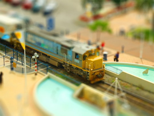
Be careful though, it doesn't work well with 3D.
Fixed picture : I'll be waiting for your new render with interest !
Saturation : it's ok, each artist has his own feelings, and if you enjoy saturation then feel free to saturate. However, I think there is saturation and saturation. I like saturated pictured, but there's a level of saturation not to exceed.
This is great :
This is too much :
I think that your picture is not far of being too much, on my opinion. Try looking at it on another PC screen, maybe ? My main preocupation is the red color of the shields.
But we'll see with your new picture !!
Blur : yeah I like blur too and I'm adding some on most of my works !
Be careful however, when you add a lot of blur : it can give the sensation that the whole scene is smaller than it really is. Like a mock up/model.
Just search for "tilt shift" on google pics, and you'll know what I mean.
it can be great, but someone else looking at your work can feel lost.
In fact, I'm sure you're gonna love tilt-shift. It uses real photos + saturation + blur to make it look like a model.
Be careful though, it doesn't work well with 3D.
-
Simon - Expert Member
- Posts: 418
- Joined: Sun Jun 10, 2012 1:47 pm
- Location: France
Re: TKG's Art
![]() by time-killer-games » Sat Oct 12, 2013 6:59 pm
by time-killer-games » Sat Oct 12, 2013 6:59 pm
Thanks again Simon, you are a genius! However I would have posted the new artwork by now, but for some odd reason sweet home 3d is acting weird with my updated project, the rending isn't working anymore, the create photo button isn't doing what it's supposed to do so it looks like I'll just have to use a different rendering engine until I can get this sorted out.
Do you know of any good rendering engine that are free? (Even for commercial use?) I've tried tons of different programs like K-3D or 3D Crafter but there's always some reason why it doesn't work for me, I tried K-3D but when it renders, even with light objects placed properly I get nothing but a black rectangle image. Blender, as powerful as it is, my scene has too many polygons for it to handle when I render it in blender the program instantly crashes. 3D Crafter seemed like it would be just what I needed after I installed it and ran it all I see is a splash screen the appears, and closes with no new window opening aft ward. It might not work on windows 7 but that's weird just about every modern windows software on the net is compatible with Win7 by now. Also, when I got Bryce it was back when DazStudio gave it out the Pro for free for a limited time.
When I got full, taking advantage of their generous deal, They sent my lisense key to a fake email (I created this email to use for the off in case if it was a scam) I created and I forgot the password to that email. Since I deleted my Bryce Installer and the installation output folder was on an old hard drive which had a virus, things aren't looking good for me.
-
time-killer-games - Expert Member
- Posts: 400
- Joined: Fri Dec 24, 2010 6:10 pm
- Location: Virginia Beach, VA
Re: TKG's Art
![]() by Simon » Sat Oct 12, 2013 9:15 pm
by Simon » Sat Oct 12, 2013 9:15 pm
No problem if you can't post your picture today.
These are external renderers for Blender :
http://www.blender.org/download/get-ble ... renderers/
From this list, I would suggest you try Yafaray, but I don't know if it supports your Bryce scene.
Check also Sunflow, which has more flexibility with different exporters
http://sunflow.sourceforge.net/
Kerkythea seems great too
http://www.kerkythea.net/cms/
It might take you some time, but try several of them to see which one works the best for you.
-
Simon - Expert Member
- Posts: 418
- Joined: Sun Jun 10, 2012 1:47 pm
- Location: France
Re: TKG's Art
![]() by Simon » Sat Oct 12, 2013 9:20 pm
by Simon » Sat Oct 12, 2013 9:20 pm
I confirm that Kerkythea seems perfect for you. It's totally free and should be compatible with Bryce.
http://www.kerkythea.net/
This is what I found in the doc :
http://www.kerkythea.net/cms/documentat ... %20FAQ.pdf
Kerkythea is not a completely independent application. It is actually a renderer
with staging capabilities. For creating a scene, you will need a modeler (an
application to sculpt your objects), from which you have to save a scene in 3ds or
obj format, or export it directly to Kerkythea xml format using an appropriate
exporter. The first thing to do in Kerkythea, is to open the file with the scene
description
Use it with the 3DS export within Bryce.
http://brycetech.daz3d.com/tutor/bryce/export.html
Good luck !
-
Simon - Expert Member
- Posts: 418
- Joined: Sun Jun 10, 2012 1:47 pm
- Location: France
45 posts
• Page 1 of 2 • 1, 2
Who is online
Users browsing this forum: No registered users and 0 guests